Documentation
“Page layout is the process of composing text, image and negative space on the page to produce a balanced, and harmonious visual impact that would allow for a collaboration of the author of the text, the artist of the design and the reader to construct collectively a meaning and a message for the text.”
XML-TEI and XSLT
For managing the three texts we have used two main technologies: TEI and XSLT. TEI is an XML-based markup language that enable scholars to store, analyze, and share humanities textual information.
The XML standard (eXtensible Markup Language) is a flexible way to create information formats and electronically share structured data through the web.
The Text Encoding Initiative (TEI) is a consortium which collectively develops and maintains a standard for the representation of texts in digital form. The TEI Guidelines have been widely used by libraries, museums, publishers, and individual scholars to present texts for online research, teaching, and preservation.
XSLT (eXtensible Stylesheet Language Transformations) is a language for transforming XML documents, and thus TEI, into other XML documents or other formats such as HTML. We have used this technology to transform TEI-annotated texts into html, in order to work upon them.
An HTML page is generated automatically for each text, thus we have created a destination page, called opera.html, on which each specific html is loaded as a consequence of an event. We have designed one template matching with the three of our texts. We have used the free trial of the Oxygen editor.
The Portrait of Shakespeare
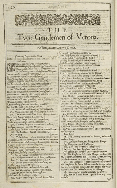
The image is taken from the William Jaggard's First Folio i.e. Mr. William Shakespeare's Comedies, Histories, & Tragedies, a collection of plays by William Shakespeare (1623). It is printed in folio format and contains 36 plays. A folio (from Latin foliō, abl. of folium, leaf) is a book or pamphlet made up of one or more full sheets of paper, on each of which four pages of text are printed, two on each side; each sheet is then folded one time to produce two leaves. Each leaf of a folio book thus is one half the size of the original sheet.
WHAT DID SHAKESPEARE LOOK LIKE?
The portrait of Shakespeare on the title page was engraved by Martin Droeshout and is one of only two portraits with any claim to authenticity. As Droeshout would have only been 15 when Shakespeare died it is unlikely that they actually met. Instead his picture was probably drawn from the memory of others, or from an earlier portrait. In his admiring verse ‘To the Reader’ at the start of the First Folio, the writer Ben Jonson declares that the engraver achieved a good likeness – he ‘hit’ or captured Shakespeare’s face well.
1600
After Incunabula

For the layout of the first style, we took inspiration from the Incunabula, the first ever printed books. For what concerns they characteristics,
"The layout designs [...] resembled the medieval compositions using classical ornamentation, initials and bordering. However, with a greater use of white space they were no longer as dark and dense as the medieval illuminated manuscripts. Some of this can be attributable to the advance of paper manufacturing technologies which created whiter and lighter papers. The incunabula layout designers made a grater use of columns for aesthetical effects."
A History of Graphic Design, Guity Novin
An example of this specific layout style can be seen in The Meditations of Marcus Aurelius Antoninus, which was published in 1792. A great secret is hidden behind these pages: the Golden Ratio.
The Golden Ratio is a mathematical ratio that can be found in nature, architecture, painting, music and, obviously, in design and page layout, too. In this latter case, when used, it creates an organic, balanced, and aesthetically pleasing composition. In the Meditations, the golden section is used
"[...] to determine the text area, and the Fibonacci sequence to arrive at relative margin sizes (inner margin 3 units; top and outer margins 5 units; bottom margin 8 units)"
A History of Graphic Design, Guity Novin
FONT
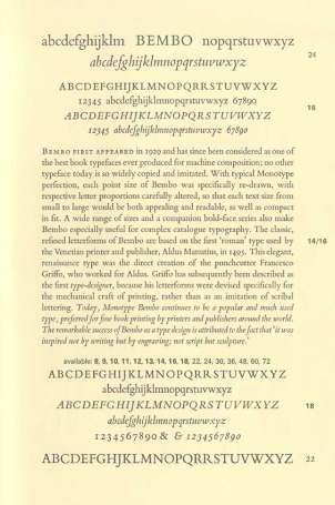
Garamond is a group of many serif typefaces, named for sixteenth-century Parisian engraver Claude Garamond. It is often used for book printing and body text. Garamond's types followed the model of an influential typeface cut for Venetian printer Aldus Manutius by his punchcutter Francesco Griffo in 1495, and are in what is now called the old-style of serif letter design, letters with a relatively organic structure resembling handwriting with a pen, but with a slightly more structured, upright design. Some distinctive characteristics in Garamond's letterforms are an 'e' with a small eye and the bowl of the 'a' which has a sharp turn at top left.
1890
Newspapers era
The invention of the steam powered press, in 1812, credited to Friedrich Gottlob Koenig and Andreas Friedrich Bauer, made it possible to print over a thousand copies of a page per hour. This began to make newspapers available to a mass audience (which in turn helped spread literacy), and from the 1820s changed the nature of book production, forcing a greater standardization in titles and other metadata. [from A History of Graphic Design, Guity Novin]
One of the greatest improvement in the book-making processs is the shift from the manual to the mechanical creation of them, thanks to the invention of the Linotype Machine (Ottmar Mergenthaler, 1886). Some years later the Monotype System was invented, simplyfing the whole process.
ILLUSTRATION
Such was the importance of images, especially wood-engraved illustrations, during the Victorian period that scholar Brian Maidment compares them to the
"use of the photograph in contemporary society"
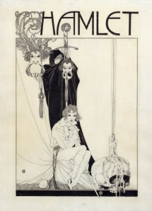
Before the development of wood engraving and the printing technology that allowed for the mass circulation of illustrated books, Shakespeare’s Works often contained just a single frontispiece or a few illustrations per play that were printed on different pages than the text. The image on the side is an example of the work of John Archibald Austen, a British book illustrator.
FONT
In the European Enlightenment in the late 18th century, broad nib quills were replaced by pointed steel pens as the popular writing tool of the day. Together with developments in printing technology, ink, and paper making, it became to print letterforms of high contrast and delicate hairlines that were increasingly detached from the written letterforms.
1920
Avant-garde and Futurism
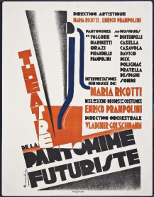
At the beginning of the 20th Century, modern art movements such as Futurism, Dadaism and Constructivism revolutionized the European layout and typography. At the same time Cubism departed from Realism and opened the vista for abstract art. Cubists analysed the representational art in three-dimensional view points and added a fourth dimension, time, which rendered the composition complex and rather unwieldy. But upon a more careful study they revealed a deconstruction of the geometry of space into rectangles, triangles and ellipses in a dynamic trajectory that redefined the aesthetics of perspective. [from A History of Graphic Design, Guity Novin]
In the Manifesto del Futurismo, written by the Italian poet Filippo Tommaso Marinetti, it is expressed the artistic philosophy of Futurism, that was a rejection of the past and a celebration of speed, machinery, violence, youth and industry. It also advocated the modernization and cultural rejuvenation of Italy. Furthermore, he proclaimed a "Typographic Revolution" against the "so-called typographic harmony of the page", and was based on the use, on the same page, of "three or four different colours". [from "Distruzione della sintassi — Immaginazione senza fili — Parole in libertà", 1913, F. T. Marinetti]
FONT
The font is inspired by newspapers and magazines, where text is the main focus. The rounded letters (b, c, d, e, o, p, q) are a bit squarish on the inside. Another feature is that of improving the rendering by allowing more "air" between each letter pair. Geometrical shapes are very important for the fonts, too.
1950
International Typographic Style
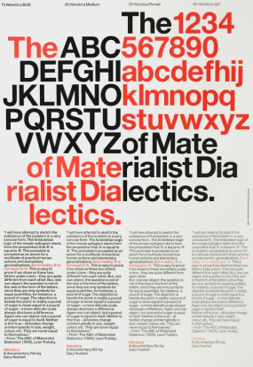
During the 1900s other design based movements were formulating, influencing and influenced by the International Typographic Style. These movements emerged within the relationships between artistic fields including architecture, literature, graphic design, painting, sculpting etc. All of these styles are defined by reductionist purity as a visually compelling strategy of conveying messages through geometric and color based hierarchies.
The International Typographic Style, also known as the Swiss Style, is a graphic design style that emerged in Russia, the Netherlands, and Germany in the 1920s and was further developed by designers in Switzerland during the 1950s. The International Typographic Style has had profound influence on graphic design as a part of the modernist movement, impacting many design-related fields including architecture and art. It emphasizes cleanness, readability, and objectivity.
Hallmarks of the style are asymmetric layouts, use of a grid, sans-serif typefaces, and flush left, ragged right text. The style is also associated with a preference for photography in place of illustrations or drawings. The 1950s saw the distillation of International Typographic Style elements into sans-serif font families, the goal of which was to create a pure typeface that could be applied to longer texts and that was highly readable. Sans serif is a type style believed to express "the spirit of a more progressive age" by early designers in the movement.
Each design done with International Typographic Style in mind begins with a mathematical grid, because a grid is the "most legible and harmonious means for structuring information." Text is then applied. [from Meggs & Purvis, 2011, p. 355]
1990
Computers and typography
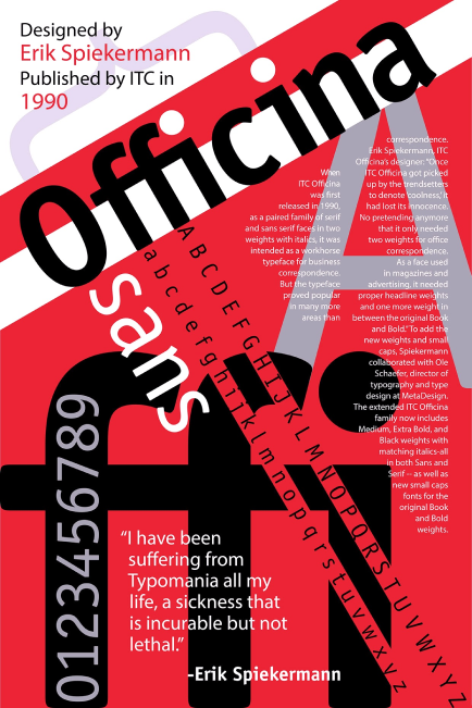
The style is already characterized by electronics and informatics, such as web design and TV technologies, which aim at forseen the expectations of the reader. The goal of this movement was to influence the public opinion, actively involving the reader. The main characteristics are the useof pop iconography, music and film.
In 1991, Neville Brody and Jon Wozencroft created the FUSE project. FUSE is an interactive magazine that sets out to challenge our current ideas about typographic and visual language in an age of ever changing communications technology and media. Brody was also partly responsible for instigating the fusion between a magazine, graphics design and typeface design, which are the basis of the whole style.
In 1989 FontShop, the first mail-order distributor for digital fonts, was started by Erik Spiekermann. FontShop International followed and now publishes the FontFont range of typefaces.
FONTS
A little bit of inked up grunge and a little old school analog flavor work together to give a vintage typewriter typeface for website and designs.
2040
The future

It is our own style: a work in progress.
We have decided to use strong colors and shapes based on movement. We don't know, dear reader, the time in which you are living, but in our world, the 2040 interactive reality, thanks to an advanced human vision (without the use of any specific additional device), it is possible to visualise the images in the real environment sorrounding the user. The images are floating in our room, in this precise moment!
It is also possible to scroll the text directly with your own eyes, without touching anything. On the countrary, for the nostalgic ones, who want to feel the words as in a written book, it is also possible to "touch" the words as if they were real objects materialised in your own hands.
It is a pity if you cannot enjoy all of this, in the moment you are reading (sadly, in the traditional way) this paragraphs! For this reason, thinking of the past generations, we tried to give an easy layout to these pages, while trying to give an idea of what we are seeing right now...
